Celebrating Amazing Sets
The set building department of the Sydney Theatre Company has crafted some extraordinary ‘houses’ over the past year. To celebrate their stagecraft, David Spicer surveyed their designs.
Appropriate
Play by Branden Jacob Jenkins. Ros Packer Theatre.

Images by Prudence Upton.
About: A sweeping drama set in a decaying house in the American south, haunted by acts of abuse dating back to the slave trade.
What Set Designer Elizabeth Gadsby said about the set.
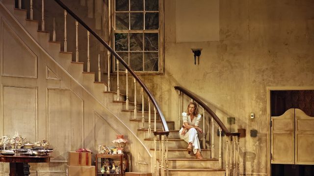
“This really was a house, with its own personality, that I would describe as an aging Dame. It was based on a decaying Georgian mansion. The French Revival style was generally two storeys.
“It was very deep. I found it hard to fit it into the theatre, as I wanted it to be accurate to the architecture of the time. I did not want any pretend rooms. The set dimensions were 12 x 14 metres. There were four rooms and an attic. The front door was close to the back of the theatre.
“I designed five or six versions of the staircase but settled on an elliptical shape. This allowed the cast to break in through the window and onto the stairs. Shattering can be done with sugar glass, but we decided to use perspex, which was pre-cracked and had to be re-glued each day.
“During the play a rock is thrown through a window, a bookcase collapses and the chandelier falls. In the script there’s a rodent, but we gave that miss.
“We added our own details such as wallpaper falling away and lights falling off walls.
“The script talks about the speeding up of time and part of the floor collapsing. There was a water leak stain on our ceiling. We decided to have the upstairs bedroom – which had had bedding, magazines and leaves from the roof thrown in - collapse into the lounge room.
“The house was a symbol of the United States, built on foundations that contrast to its ideals. It took five weeks to build. I do not know how long it took to bump out – I could not bear to watch it being pulled apart.”
Home I’m Darling
Play by Laura Wade. Drama Theatre Sydney Opera House.

Photographer: Prudence Upton
Designed by Genevieve Blanchett. Directed by Jessica Arthur
About: Judy is a picture-perfect ‘50s housewife, married to Johnny. They’re totally happy with their pastel-hued life. The only problem is it’s not the 1950s, it is now, and their life is falling apart.
What critics said about the set:
“On one level of the brick row house was a gleaming kitchen, fitted out with the most modern 1950s appliances leading to the chic loungeroom, where martinis were served under the watchful gaze of three ducks on the wall. Upstairs, a bedroom connected by a hall to a bathroom, where every ceramic surface and tile was pink.” Stage Whispers.
“The outstanding set and costume design steals the show. From the ‘50s fridge to the disgustingly pink pastel bathroom, Blanchett’s set is both real and somewhat false at the same time. While the setting for the production immediately evokes an American comedy, Blanchett’s keen eye for detail takes in the very structure of the property, an English Garden City suburban home.” Arts Hub.
“The house is all pastel finishes and retro furniture; the costumes are vintage delights. Even the kitchen cupboards come pre-loaded with period props, which appear at awkward moments to send the dream spinning off course. And beyond the thousand tiny details, in the final scene, the ingenious set becomes a key character.” Sydney Morning Herald.
Playing Beatie Bow
Adapted from the Ruth Park novel by Kate Mulvany. Wharf Theatres One and Two.

Photographer: Daniel Boud.
About: Time travelling drama from the hustle and bustle of Sydney’s The Rocks in the present day to the year 1873.
What set designer David Fleischer said about the set.
“The play opened the newly renovated Wharf, which has the capacity to have a longer stage. There are two adjacent spaces, previously known as Wharf Theatre 1 and 2, which can now be used as one space by rolling back a soundproof bifold door.
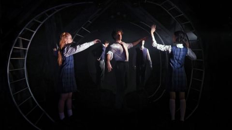
“It seemed fitting that a play about time travel and magic lent itself to a space with more depth, as it gave us the capability to create magic with the light and use the negative (dark) space for moments of theatricality and storytelling.
“It was a very minimal set build. It is centred in one single house with a couple of rooms and a confectionery shop. We had a small cast who portrayed a vast array of characters.
“Our props included a table, a few windows and a non-descriptive set of chairs. They were reconfigured in different ways for the kitchen and bedroom. We trained the audience to recognise which room we were in. The minimal set allowed the house to flow in a way that was needed to create its own set of theatre magic.
“We also needed bold theatrical moments to match theatrical scope of production - when the cast went out on the ocean a big sail cloth was used to utilise the full capacity of space.
“For the market scene, where Beatie Bow chases Abigail out of house and goes off to The Rocks, we used an additional set of window frames for those characters to scurry through.”
You can purchase a copy of the script of Playing Beatie Bow at www.booknook.com.au


