Madame Butterfly
Opera Australia's new production of Madame Butterfly is beautiful and stunning; a sumptuous treat for the senses and emotions.
I've been specifically tasked to focus on the new tech and video projection OA is using. If this production is anything to go by then OA are on the mark with not only the use of current tech but being the innovators in its development.
However, whilst this review will focus on the design and tech aspects it would be wrong to not praise the cast, orchestra and creatives for what they created on stage. The singing is sublime, with the performers conveying the right emotion and meaning not only in their singing but also in their acting. They breathe life into these characters and make them credible. For those who like to hear the ‘money notes’ being flawlessly performed then this is the show to see. The opera's big aria, “Un bel di”, rightfully stopped the show.
Directors Graeme Murphy and Janet Vernon ensure there is always something to hear and see throughout, with movement and staging both clever and thought-provoking.
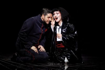
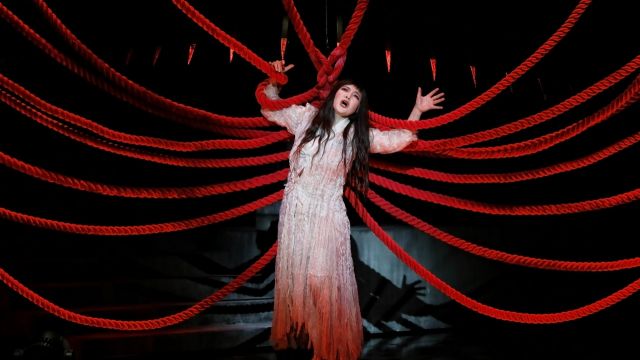
The colour palette is chiefly black and white, both in the scenic design and costuming. And it's a harsh black and white, with those extremes of the spectrum speaking for what's going on with the subtext. Greys are sparingly used; colour less so. When the colours do burst through they are intense and neon - almost garish. The only time we see muted/ pastel colours is in the costumes of the non-Japanese characters. Even Hokusai's Great Wave of Kanagawa puts in a cameo - upstage in black and white.
 Fourteen (yes, fourteen) huge vertical video screens fly around the stage, sliding like shoji doors on which the backdrops are screened. There is a double revolve, and OA's truck and rise with tilted platform is centre stage. At times the screens align so as to look like a natural extension of the auditorium onto the stage. Whilst it's impressive seeing the screens fly around they never do so in times that could upstage the cast. And unlike the recent revival of the Ring at the Met, this design is one you can appreciate no matter where you sit.
One effective moment is in “Un bel di”: as Cio Cio San sings we see the lyrics as Japanese characters appear on the screen as if floating out of her. They float upward and gather, everything all delicate and soft, but only to later crash down and fade. It's the perfect synthesis of tech, media, and performer to realise the potential of the emotion and text.
The design is futuristic with feudal Japanese fantasy inspiration - as though some Shogun went to the future and watched Game of Thrones, returning to redecorate his abode accordingly.
I know the purists will be shrieking blue murder but trust me: it all works. The mash up of time periods and Warhol-like use of colour serve to both emphasise the emotional state of the characters, and to alienate them from the larger world: these are Puccini's "little souls" moving through a big impersonal world, and the anachronisms suggest this is a timeless phenomenon.
Some things I thought were gimmicks but was proved wrong: In Act 1 Goro shows Pinkerton around his new digs in Nagasaki. Goro uses an iPhone to summon the servants (two on-screen androids) and control other domestic activities by clicking, pointing, or swiping across the iphone's screen. Given the Japanese passion and innovation for technology it's a nice comment. However the real impact of Goro's iPhone use is brought home in Act 3 (no spoilers).
 Similarly when the Bonze arrives to admonish Cio Cio San for abandoning her religion and marrying a Westerner he wears a huge origami crane on his back - representing the old ways. It looks like a gimmick but it's not: we see those origami cranes later on with more profound effect (again, no spoilers).
There's use of sly humour too: when Cio Cio San finds out Pinkerton is returning she goes to pretty herself up for him. She returns looking like a nightmare version of Cher: black latex miniskirt and bad 80s curly wig. It's a subtle dig: is this what she thinks Western (American) men want and see as classy women, or is this how they truly want and see them. The outfit is soon discarded when she sees Pinkerton's wife dolled up in Jackie Kennedy 60s chic. And let's not forget the two dudes with chrome hubcaps for samurai hats.
Only one thing didn't work for me: in the Act 1 duet when the lovers sing on their honeymoon night we see projections of two dancers on a front scrim. The dancing is sensual and beautiful, however it distracted from the live cast. By all means drop the front scrim and float in the dream like ripples, but this was the only time when I was distracted by the tech and ignored the singers. All other tech kept focus and never upstaged the cast.
This production proves that when used properly modern tech can enhance and benefit a cast and show.
Peter Novakovich
Photographer: Prudence Upton.
Subscribe to our E-Newsletter, buy our latest print edition or find a Performing Arts book at Book Nook.

