Fairy Tale Designs
Stage productions are becoming more spectacular than ever as designers combine animation, LED light projection and traditional set pieces in new ways. Beth Keehn speaks to the creatives of a large-scale Disney musical blockbuster (Beauty and the Beast) and a pro-am community show in a regional venue (Cinderella) to compare what new and old tools they use to create magic on stage.
Beauty and the Beast
Stanley A Meyer has been working in stage design for nearly four decades. From small regional theatres, Stanley moved to national stages across the US before joining the world of rock and roll stadium tours and theme park outdoor spectaculars. His work for the Disney Theatrical Group started with a nervous pitch with costume designer Ann Hould-Ward to Disney, presenting stage designs for Beauty and the Beast in 1992.
Beth Keehn (BK): How does it feel to be part of something as wonderful as Beauty and the Beast?
Stanley A Meyer (SM): It’s amazing because it all started with 140 black and white storyboard sketches I created to pitch the show. At the end of the presentation, we were shocked because the Disney executives just said YES! And here we are, 30-something years later, and this is the tour de force Disney show – running for 13 years on Broadway, and seen in countries across the world.
BK: How have your designs evolved between 1995 and 2023?
SM: The design is completely different from the original. My favourite new element is the large scrolls that fly in and move around the stage. While it looks technically amazing, it is the most rudimentary of all the scenery movements: flying in and out, tracking side to side, and rotating. So, we put all three together and it’s a magical way of creating the Beast’s castle.
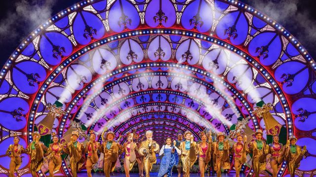
Today the visuals are over-the-top fabulous with LED technology – but nobody has to change a lightbulb. Another lighting change is in the ‘Be Our Guest’ number: in the original productions we used real neon lighting. It was flamingo pink, but neon is very fragile. Now that scene is all LED, but it looks exactly like neon and can be any colour you want!
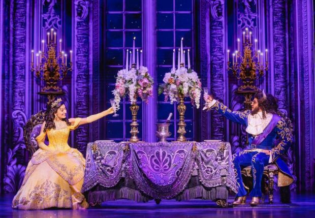
The other thing I’m proud of is the artwork for the dining room, based on French 18th century rooms. We go into the dining room, and it opens up into this beautiful garden – it looks like the scenery is splitting apart, but it’s actually an LED screen. Our LED drop of the town scene looked so much like a scrim that one of the reviewers in Sydney said they couldn’t believe the number of hand-painted drops in the show – but it was all digital content.
BK: Have audience expectations changed over the decades?
SM: I think they have. But also, I go back and work in small regional theatres quite a bit, and the audience can still be drawn in and wowed by the simplest thing – and that has to do with story. If the story or the musical is good, you can do it in a Black Box with no scenery and it will carry and it will make you emotional.
BK: How has the changing technology affected your skillset?
SM: When we first programmed the deck in 1993, it took five hours. It’s nowhere near that time today. We now use Rhino 3D for 3D computer-aided design (CAD) drawings. In the old days, you’d have to lay out every detail and then the shop would have to do drawings – now they just take your 3D drawing and they build from it. And, although everything is created in digital format, I still draw. I do some Photoshop work with my own drawings, but I sketch and then I work with one of my associates who is a digital artist. Because I’m drawing by hand – it’s not in a computer – the final result is a little more free and that’s represented in the work.
BK: How has the technology affected your design process?
SM: It’s all about the script and a ton of research! I drew on all kinds of things for this production – for the initial presentation, we had boards with research images and we just talked about the design. For our concept renderings, we used a mix of hand-sketched drawing, hand-painted and Photoshop images. I’ve also used stop animation to show the team an effect I was trying to achieve.
One part of the process that hasn’t changed is collaboration: I believe that the best idea wins. People have their own forte and I think you get the best product from everybody if you work together. Collaboration involving all of the artists in our show was key to success and how it has thrilled audiences. For me the set is a platter that the rest of the show sits on. It’s not a competition; it’s all about supporting the show and how it works and how the story is told. As you can tell I love my job and am thrilled with how our production finally finished in Australia. And it makes me so happy that our show is inspiring a new generation of theatre artists and audiences.
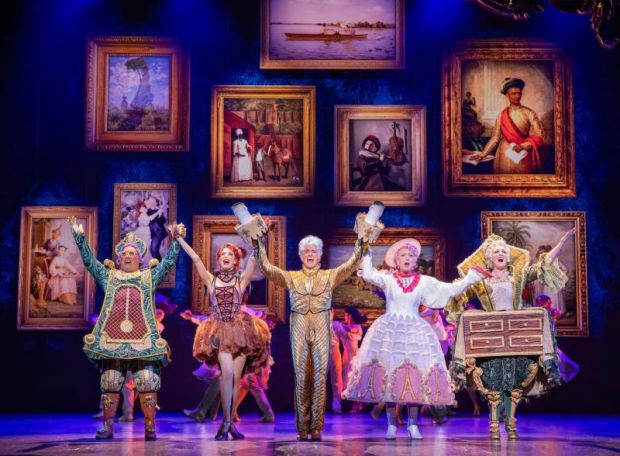
Beauty and the Beast images by Daniel Boud
Cinderella
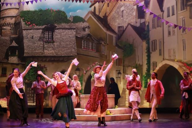
As Beauty and the Beast was opening in Brisbane, the musical theatre team that has produced community pro-am productions at the Empire Theatre in Toowoomba for 23 years was taking on Rodgers and Hammerstein’s Cinderella, with scenic design by Frances Story.
Frances Story studied Architecture and Dance at Queensland University of Technology in Brisbane before starting in scenic design with Iceworks Design in Brisbane, where she has worked for nearly a decade on arena experiences, operas and musicals.
Beth Keehn (BK): How do you start?
Frances Story (FS): With research – lots of mood images – defining and honing the direction. I do a script breakdown and extract the design elements. I then sit down with the director and add notes about how they see the visual show unfolding. It’s a collaborative development with multiple meetings. The next steps include more research – finding visual references that are going to speak to the look and feel of the show.
BK: How does new technology play a part?
FS: I do use digital technology but for mood images, I start sketching. For me that’s the best way to develop ideas without the constraints of a 3D modelling program. For those programs you really have to know what you want the software to do and manipulate it – otherwise you end up with a bunch of boxes that don’t really convey the look and feel of the show. For me, in those initial stages with the director, it’s me sketching it out, because I can convey ideas quickly that way.
Once we’ve got a direction, that’s when I start 3D modelling. Because of my background in architecture, I define the design and deliver all the construction plans so I know exactly how it’s going to be built, and that gives me the most control over the end outcome.
BK: Have you had to train to keep up?
FS: With the addition of technology, the audience experience may have changed, but our job is the same – to engage them and communicate the story. When I graduated from university, I came out with a skillset of hand drawing and hand rendering – but that is not functionally practical in the theatre industry. So, I developed my skills in digital programs. For 3D modelling, I use 3DS Max; for 2D Drafting, it’s CorelDRAW; and image editing software through Adobe Photoshop.
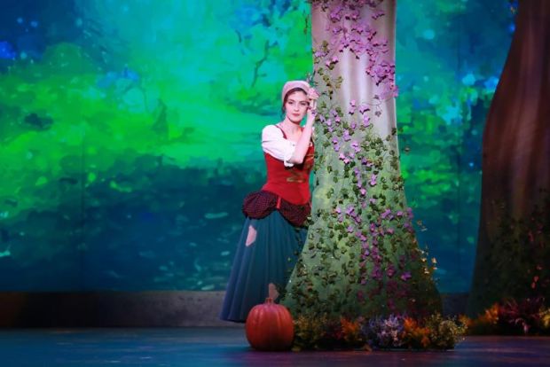
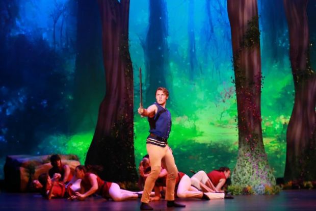
I also partner with experts. At Iceworks Design, we first used projections around 2018 on an arena show of The Wizard of Oz – we partnered with the illustrator and Optikal Bloc to achieve the animation for the show. We are seeing more LED lighting and projections, which we use to augment a physical setting. So, you are seeing that richness of a visual layered storyline – a rich tapestry that can add to the layers of the story and audience experience. And we certainly used that in Cinderella to show the magical sense of the story from the Fairy godmother’s perspective.
BK: What was the main technical challenge in Cinderella?
FS: Cinderella has so many different scenes, the technical challenge was making sure that we made those happen, while also working within the constraints of the number of personnel – the number of flymen, mechanists – and the limited time within the number of bars of music that we have to complete the scene transitions. I wanted to design it as a physical set so there is a nostalgia when you experience a set moving on and off stage. We had physical backdrops – they are not projected images. For example, the moon is a real piece of stage scenery: it’s not a projection. So, when that changes, it’s happening before your eyes and there is a tangible sense of the magic on stage!
Cinderella images by Justin Nicholas.

