The Swinging Sixties on Stage: Designing a Thriller.

Entertaining Mr. Sloane is a thriller. It’s about a psychopathic but gorgeous killer who is enticed into sexual liaisons by a landlady and her brother. It’s set in swinging sixties in a house next to a rubbish dump. Victoria Lamb designed both set and costumes for the State Theatre Company of South Australia’s July season. She discussed her design process with Stage Whispers.
What was the brief / interaction with the director like prior to designing Entertaining Mr. Sloane?
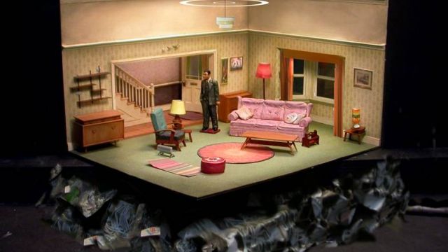
Sloane is a comedy set in the lounge room of a working class English row house that sits on the edge of a rubbish dump. The period is 1964. Therefore our discussions were focused mostly on how to create this setting rather than on what the setting would be. Deciding on a tone was important; the play is essentially in a sitcom format, so this provided the basis for the design decisions.
Can you give us a brief description of your set and costume designs?
My aim is to present a slice of reality, as far as it is possible on the stage, while still creating an intimate space with a deliberate aesthetic composition. I’ve opened up one of the walls to reveal the hallway and create a sense of depth. I hope the audience will feel like they are looking right into someone’s home, right down to the details of the nicotine stained plaster, peeling wallpaper and the doilies on the couch.
For those who remember 1964, there will plenty of familiar references. Who can resist details like the ducks on the wall, the sunburst clock, the beveled mirror and of course the coral souvenir ornament.
The rubbish dump will sit on the auditorium floor around the front edge of the set, indicating that the audience is sitting in the dump itself.
To what degree are you sourcing materials and props? How do you go about sourcing them?
As far as possible I am seeking actual period props and dressing. This will mean many hours trolling the charity shops, second hand stores, and the odd hard rubbish collection for suitable pieces.
What inspirations and research have you drawn on?
I was fortunate enough last year to spend a month living in a 1950s row house in London, so the layout and architecture are very closely based on that actual home. The Director and I also looked at many films, architectural and fashion books, and even referenced family photos from the 60s.
What statement do the set design and costumes make about the world of the play and the characters? Any symbolism, etc?
I felt in this case the play was best served by providing the setting as described in Orton’s text and letting the underlying themes speak themselves for rather that imposing any major visual statement. Of course the home located in the midst of a garbage pile will imply a certain symbolism of its own.
What are the challenges / joys of creating these, or other sets and costumes?
The design challenge is in the detail; in really bringing a sense of life and history to a lived-in home. The costumes have been a pleasure to design. There is the opportunity to become immersed in the fashions of the early 60s and have a little fun with it.
Any intriguing little secrets behind your design?
The wall paper is genuine 1960s vintage and is being sent over from Germany.
The purple “baby doll” nighty with feather trim and pop-poms is based on an actual one I remember my mother owning in the early 70s.
You’re designing both set and costumes, as against co-ordinating with another designer. Do you prefer this? Are there pros and cons?
I have only ever designed both set and costumes for my productions, I enjoy doing both, it is nice to have that sense of overall continuity. Though I think it would be interesting to collaborate with another designer.
You've also designed a trendy, theatrically themed bar. The Boho Bar in Parkside, Adelaide. Tell us about that project - the brief you had, how you went about it, the final result.
I was presented with a brief to create a ‘Moulin Rougey-circusy-sideshowy-stagey’ themed space. I went away and created a model incorporating these ideas as well as including references such as the Spiegel tent, music hall and balancing the different areas of the bar between backstage grunge and Victoriana glam. The owners loved the model and ten months later, working closely with the architect and specialized scenic artists and technicians I bought in from the theatre industry, the “Boho Bar” was opened.
My task was the concept design, and art direction I even ended up naming and branding as well as designing the look for the building exterior. Creating something that was going to last more than a few weeks was a new challenge too, but it has been running as a successful, trendy bar for five years now.
Do you go there yourself for a drink? How does that feel?
I have enjoyed the times I have been and am very proud of what we accomplished. It is nice that it continues to give people a fun night out. But, I could probably count my visits on one hand. For me the fun was in the making and I think spending ten months in there overseeing every detail was quite enough. However it would be great to work on another project like this one day.
Originally published in the July / August 2010 edition of Stage Whispers


