Designing The Light in the Piazza
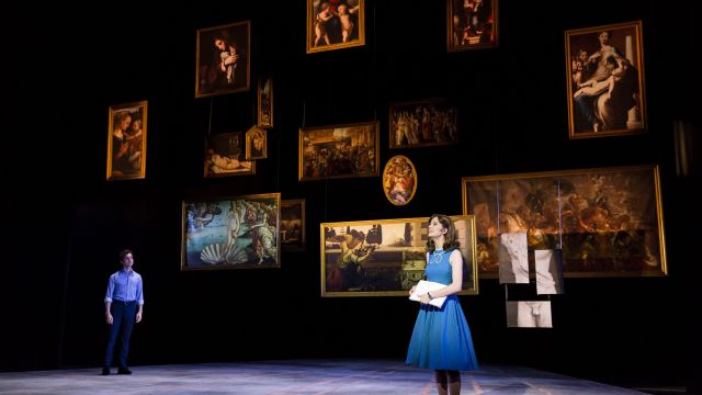
Tom Willis explains how he designed the lighting and set for the stunning production of The Light in Piazza staged by the Life Like Company last December in the Melbourne Arts Centre.
I try to start each design process, regardless of the show, with the idea that my primary responsibility as a designer is to support the performer and the text (and in the case of a musical or opera, the score). It’s not so much about imposing ideas as it is about framing them, and often elevating them or providing clarity and context.
In the case of The Light in the Piazza, a musical by Adam Guettel and Craig Lucas based on the novella by Elizabeth Spencer, the story is deceptively simple. A young American girl meets an Italian boy while on holiday with her mother. The two fall quickly and madly in love, and whilst circumstances beyond their control threaten to derail the relationship, the strength of their devotion to each other prevails. The final scene takes place on the steps of the church within which they will marry.
One of the first steps in the design process is to read the script and meet with the director. It’s in these early conversations that we start to talk about the world we intend to create and the rules and conventions that govern both the look and feel of the show and how the characters interact within it.
Theresa Borg, our director, gave me some very clear parameters. “I want to take our audience to Florence,” she said. “I want to feel that ‘light’ that you feel when you’re walking down the street early in the morning.” For Tess, Florence wasn't simply a setting for this piece. It was a character. “And remember,” she said, “everything has to be beautiful.”
The original Broadway production made highly effective use of Florentine architecture to expand and contract the stage. The design was substantial, a combination of sky and stone, pillars and plinths. It would have been a great mistake for us to try and replicate this highly elaborate (and very costly) production. We didn't have the budget to build large physical set pieces. Also, we had the added complication of having to design a show that would ultimately end up sharing the space with another production (a children's pantomime). This meant that we needed to design something that could be effectively bumped in and out of the theatre each day.

My first concept for the scenic design was based around a number of large square shaped columns that could be rearranged around the space to create the various locations and scales required to tell the story. While we’ll never know for sure, I think it was a good concept that presented great potential for the interplay of set and light, while also playing with scale and height. Unfortunately for me, one of the many challenges of scenic design is trying to work out how much everything will end up costing. For the columns to be effective, they had to be big (approximately 5m in height) and while we fought hard to find a way to make them a reality, it was ultimately deemed too expensive to do properly. A big mistake is not to realise an idea fully. Sometimes it’s better to go back to the drawing board and start again, as daunting as that might sound.
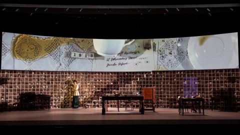
My final design consisted of three key elements. The first was a floor, a giant wedge constructed of timber but scenic painted (by the remarkable Mattea Davies) to resemble stone or concrete, inlaid with lines of bronze that divided the wide surface into smaller sections.
The second element was a series of paintings, suspended over several fly lines, that could be flown in to various heights to create multiple arrangements and configurations. Embedded into these arrangements were silhouettes of the Florentine skyline, including the clocktower of the Palazzo Vecchio and the great dome of the Florence Cathedral.

The third and final element of the design was, of course, the light. Initially I had intended for the rear of the stage to be adorned with a massive painted cloth of a romantic cloud-strewn sky. We would use this surface effectively as a cyclorama, bouncing masses of light off its textured imagery to frame our stage.
For a whole bunch of technical and practical reasons, I ended up moving away from this concept and instead settled on the idea of placing the floor in a black void, and then used backlight and haze to draw the space up out of the ground. I didn't just want the light to be cloth at the back of the stage. I wanted it to be something three dimensional that the actors could move through and around.
I wanted light to extend from doorways in sharp corridors, or to cascade from above in giant slabs, as if sunlight bursting through clouds.

I also wanted to be able to focus right down, and at certain times divide the stage to provide smaller concurrent spaces that could juxtapose different locations side by side. I always wanted the actors and the art to be the dominant elements in the space, to make sure they never got lost or overwhelmed by the design.
We installed and teched the show over the last week of October 2016, opening on a Friday night to positive reviews and heartfelt applause. A cast of extraordinary performers brought their characters to life and imbued them with warmth and emotion. The music was staggeringly beautiful, realised by a chamber orchestra rich in strings that soared through Guettel’s magnificent score.
Sometimes all I think a good designer needs to do is get out of the way and let the performers and musicians do their thing. I’m always in awe of what these talented human beings are capable of.

If I had to pick one moment in the show as a favourite, it would be at the end of the first act as the two lovers finally embrace for the first time. Tess often talked of the show’s narrative as a fable; a simple story through which we could explore the ideas of love and dependency. Our two young leads, Clara and Fabrizio, are real enough, their actions and feelings entirely relatable, and yet they are also mythical characters in a sense, the embodiment of a story told again and again throughout history.
While some scenes in Piazza required a great deal of thought and problem solving to realise, the Act I finale had always been really clear in my head. The two lovers come together in silhouette, their small bed an island in a great void of darkness that transcends the boundaries of Clara’s humble hotel room.
High above, half in shadow, the faces of gods, kings and muses look on knowingly. These painted characters embody the very soul of the city, its beauty and history. In this moment, these images shift and re-align to frame the young couple at the centre of a tableau, like a star surrounded by planets. The young couple at the centre of an ancient city, their embrace its beating heart.

The Light in the Piazza was performed at The Playhouse, Arts Centre Melbourne from October 28th to November 6th, 2016.
Tom Willis is a lighting designer based in Melbourne, Australia. He works across a diverse range of theatre and performance projects including musicals, dance, drama, puppetry, circus and cabaret.
Photographer: Ben Fon

