Creative Collaboration on The Dictionary of Lost Words
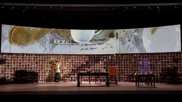
Verity Laughton’s stage adaptation of Pip Williams’ best-selling novel The Dictionary of Lost Words, which returns as part of the Sydney Theatre Company's 2025 season at the Roslyn Packer Theatre from March 1 to 22, was a technical triumph and commercial success. The novel tells the story of fictitious Esme Nicoll from the age of eight in 1886 through to a thirty-three-year-old woman in 1915, set against the creation of the venerable Oxford English Dictionary.
While the principal stage set is the ‘Scriptorium’ – or ‘Scrippy’ - the shed where the dictionary editors work - there are numerous other locations. The huge time span, unusual for a stage play, also presented creative problems for the theatre makers: Director Jessica Arthur, Designer Jonathon Oxlade and Lighting Designer Trent Suidgeest. They all read the novel – and sometimes referred back to it - but their task was to realise Verity Laughton’s complex adaptation script. Their creative collaborations (and a great cast) brought this multi-layered story to life.
Designer Jonathon Oxlade’s inspired set design for the Scriptorium comprised over seven hundred pigeonholes, curved across the whole width of the stage, and fronted by desks covered with books and papers; it was both utilitarian and suggestive.
Stage Whispers Michael Brindley spoke to Lighting Designer Trent Suidgeest.

Image: Trent Suidgeest
Michael Brindley: I’m assuming Jonathon’s basic Scriptorium design was a first step?
Trent Suidgeest: Jess and Jonathon had some time together to work out the concept and over-arching style, and a pass at the physical structure. Then I began contributing as Jonathon continued to dig into his designs. The idea for anchoring the show inside the Scriptorium and the Projected elements is all Jonathon and Jess, then how we morph these elements to keep the show evolving is where we all continued from.

MB: While the basic double height set of the pigeonholes was fixed on stage, your lighting had to suggest or enhance not just the passage of time but a variety of other locations besides the central ’Scrippy’. There’s the maid Lizzie’s room, various exteriors, the street, the market, a pub, the typographers’ space and the Bodleian Library. How did you approach that challenge?
TS: Yes, I’m not sure I’ve ever designed a play where the lighting requirements were so diverse, but it’s a huge story to tell so the lighting needs to contribute to that in many ways.
Aside from traditional stage lighting from all angles, one of the exciting design concepts for me was the way we lit all of the pigeonholes. The marvellous production team at State Theatre Company of South Australia fitted every pigeonhole with a custom LED pixel chip - 770 in total - all delicately strung throughout the shelving walls. The pixels are colour changeable and individually controllable, so I use specific pixels to compose suggestions of windows glowing, or gradients to focus our attention.
Those lights are used to transform the basic set into many locations - always complementary to the stage action and the projections. [Of which more later.] Some of my favourites are: an oversized tartan wiping across during a transition and the suggestion of a cobblestoned street during an outdoor scene using random intensities of greyscale. We also found a couple of moments for some shadow play beyond the pigeonholes, on their back surface, so we used a material which took light from behind.
I designed two additional layers of lighting from upstage - one washy, one to cast shadows of humans - to be able to create silhouettes of people, the slips of paper (for introducing ‘found words') and props in the pigeonholes. Sometimes the backlit shapes of all of those props are more interesting than seeing them lit by the individual pixels internally.

MB: The changes of location - especially to the market and the pub - were always clear and achieved so efficiently via some furniture movement, minimal props and costume changes. Your job was to add another layer - without your work being too obvious.
TS: I was actually sometimes nervous that the shifts in lighting were too overt! I’m always tracking the reveals of the various elements and the depth to which the lighting shifts aligned with Esme’s journey. As the world widens for Esme so too does the degree to which the lighting supports that. The colour and shape in the lighting become richer; more vividly presented.
Once we’re into the pub scene and dressing room we’ve built into full red and amber highlights, which then allows the world of the Scriptorium to be our anchor in versions of bright warms and daylight, and ultimately the stark cold whites comes with scenes of pain.

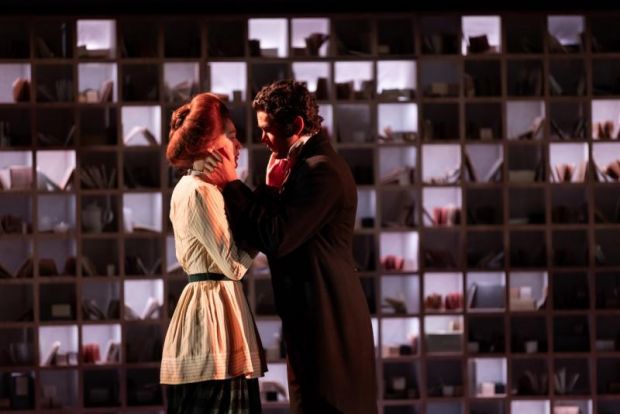
MB: A particularly fine sequence occurs late in Act II, when Esme must tell would-be fiancé Gareth about her past. It’s beautifully staged by Director Jessica Arthur: it had no words yet was absolutely clear and almost a suggestive dance. The characters became moving silhouettes. What is the role of your lighting in this sequence?
TS: Oooo yes, definitely a crowd favourite! This montage sequence was conceived by Jess as a climax. We have a suspension of reality with all of the key memories of Esme’s life leading up to that moment.'
I created an effect with the pixels in the pigeonholes, all pulsing randomly and rhythmically. My desire is for it to feel like the words that Esme has collected along the way and/or various moments in time, are swirling around her. I wanted it to sparkle and shimmer to heighten the magical realism we were pursuing. It is a big theatrical gesture!
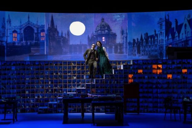
MB: There is a staircase too, cleverly hidden in the pigeonholes, to an upper level, a platform principally used as Lizzie’s bedroom (Esme has no room of her own that we see) and the lighting there was quite different to that of, say, the Scrippy. Rather cold? Any comment on that?
TS: Interesting you mention that, because that is a direct example of me picking up on that detail while re-reading the book during rehearsals: "Lizzie saw it coming, so she scooped me into her bony arms and trotted up the stairs. The room was cold. Lizzie took the coverlet off her bed and laid it on the bare floor like a rug.”
As the show progresses, I warm up the lighting in the bedroom as the relationship between Esme and Lizzie builds and Esme’s collection of ‘forgotten’ words that she hides in Lizzie’s trunk become the heart of the show.
MB: Jonathon’s design restricted Lizzie’s room to just the bed and that very important trunk. Was that an extra burden on lighting?
TS: The bedroom scenes are particularly important for us to focus on the storytelling and relationship with Lizzie, so the clean scenery is useful in that way.
The projected imagery always helps to help support those pillar moments; the pin cushion, the hatpin, the reveal of the scratched title, collected words and the dictionary. There is always a point of interest.
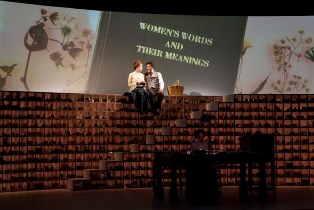
MB: Whose idea was it for the actors to use an overhead projector to project those key images – the ‘pillar moments’ - from the central desk onto the cyclorama?
TS: The concept came from Jonathon together with Jessica – to create transitional scenography using words and ephemera. The objects and compositions developed right through rehearsals, as needed, to articulate places, dates, words, etc.
The actors were choreographed alongside the action - to composite the physical imagery together while live projected onto a cyclorama screen above the bookshelves. I love that it’s all tactile. It speaks to Esme’s collecting.
The surface under the camera is a Lightbox internally made up of five gradated sections to allow me to light the more transparent backgrounds of plastics, silks and lace doilies (for instance) from below, together with hidden lighting within the camera’s shroud from straight down, and sidelight from above in the rig. All the light sources were LED colour changeable, so we could finesse the exact colour and intensity combinations. In being able to light all of the projections live and then have everything cued within the lighting cues helps it move like transitional scenery.
I spent a great deal of tech rehearsals lighting the objects and props under the camera for the projections. It felt like lighting large scale traditional scenery backdrops. I work to find harmony between the lighting of the actors and pulling all of the miniature projected scenery together into cohesive stage pictures.
MB: Well, as an audience member, the harmony and cohesion between all designs really showed. You all did a marvellous job with an expansive and challenging text. Thank you, Trent.
https://www.trentsuidgeest.com/
Photographer: Daniel Boud.

